
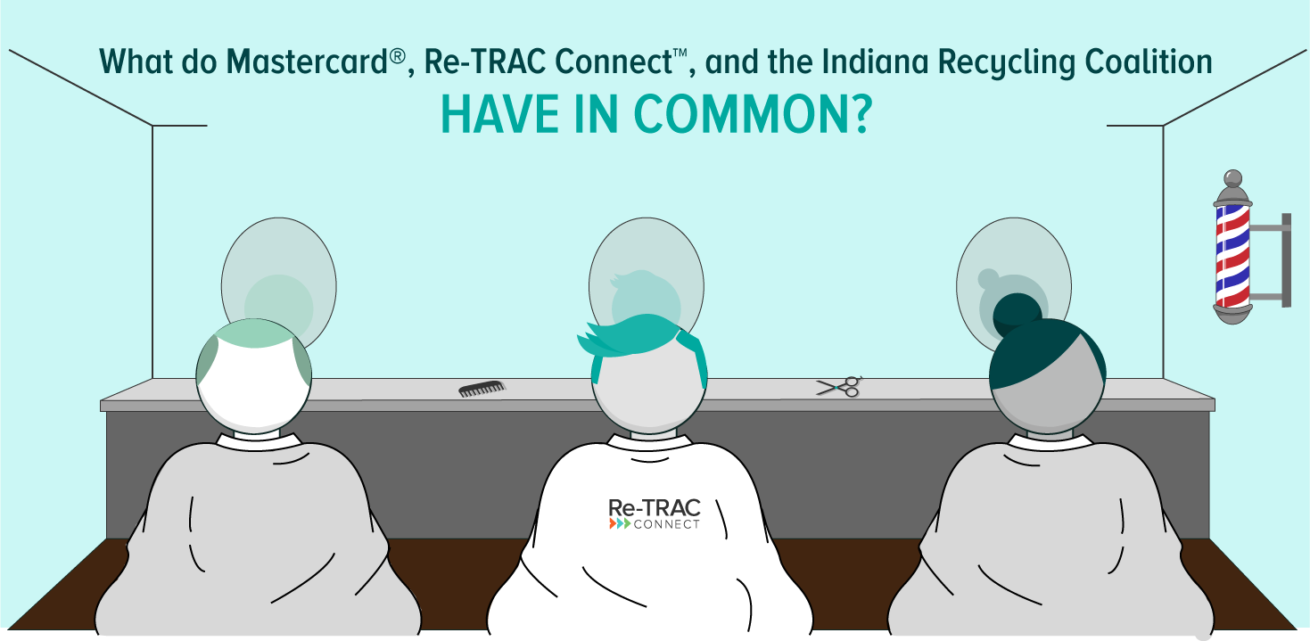
What do Mastercard®, Re-TRAC Connect™, and the Indiana Recycling Coalition have in common?
If you answered “They all contain the letter ‘A'”, you would be correct.
If you replied “They have all been around for over 10 years!”, you would also be correct.
They have something else in common, though – something a little more subtle. Each of these companies has experienced a brand haircut.
What’s a “brand haircut”, you ask?
Great question!
What’s so important about a brand?
Your brand is more than just a collection of colours, images, and words. It’s your reputation with customers and the marketplace. It’s what makes your company or product distinct from other companies and products. It’s the flash feeling you get when you see a logo or tagline; an emotional response to every experience you’ve ever had with the brand. Perhaps you remember grabbing a bottle of Coke from the cooler at your family’s annual picnic. The crisp popping sound of the cap invites a moment of heart-warming nostalgia. Or maybe it’s the time you stayed up late to watch a product release announcement delivered by Steve Jobs. And we hope when you see the Re-TRAC Connect logo you experience a sense of accomplishment for helping to divert waste from landfills.
So what does a brand haircut look like?
As the qualities that make up a brand evolve, an organization may choose to re-brand completely or undertake a brand refresh. You can think of a re-brand as an entire wardrobe change. It’s a big undertaking and it’s often necessary if the organization’s name or its ownership changes. Another reason to re-brand would be if an organization wanted to re-position itself in the marketplace. If Re-TRAC Connect wanted to become the data management system for space missions to Mars, for example, we would certainly be looking to re-brand.
Alternatively, an organization can choose to undertake a brand refresh when it needs to update its look; like a haircut. Many elements of the original brand remain (colours, styles, etc.) but they’re tweaked to achieve a refined look that better reflects the evolved brand. To illustrate this, here are some examples from well-known brands:
MasterCard
Mastercard moved the company name below the familiar yellow and red circles, dropped all letters to lowercase, and used a new font. The company even considered removing the name “Mastercard” from its logo altogether but opted for the safer approach.
Indiana Recycling Coalition
The IRC refreshed their brand in October of 2012 to give it a more modern and professional look.
Other popular brands
- Apple® has changed its logo many times over the years. Its most recent logo is a simplified monochromatic logo (usually black or silver) instead of the “glass” theme look. Read more about Apple’s brand evolution here.
- Coca-Cola® made more significant changes to their brand. Recognizing the brand equity it had developed with the classic logomark, the company chose to remove the bottle and cap from its logo entirely.
- Pepsi® also made significant changes to its brand when it slightly revised the swirl in its logo and changed its font & color.
Re-TRAC Connect gets a brand haircut
If you haven’t already noticed (we hope you have!), we took Re-TRAC Connect for a brand haircut. New year, fresh look! We chose to update our fonts and replace the mobius loop with three forward-facing arrows.
Our clients and user-base expect Re-TRAC Connect to be innovative and the brand should reflect our forward-thinking, progressive approach to waste diversion. The shape and balance of the new logo elements help achieve this. Removing the mobius loop from the logo was the most challenging decision – which I’m sure Coca-Cola also found when it decided to remove the bottle from its logo. But like Coca-Cola, we feel like Re-TRAC Connect has become the software the recycling industry pictures when they think of waste and diversion software.
We’re very excited to launch our brand refresh and encourage you to use the media section below to download the logos for any of your collateral referencing or linking to Re-TRAC Connect.
If you’d like our assistance, we’d be happy to help, just email us here.
Full Color
Reversed with Color
Reversed
Logomark
Logomark reversed