The New & Improved Re-TRAC Connect Experience
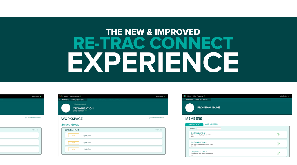
At the end of 2016 we updated the Re-TRAC Connect brand and introduced a new logo and colour refresh. It was around this time that we decided to give our software a fresh new look. But modernizing the interface was only a small part of the project. We also sought to optimize workflows, improve language, and simplify reporting.
It should come as no surprise that we believe the best way to start any project is to collect data and then analyze the results before making any decisions. We started this project by launching a campaign to collect feedback from our clients and their program participants. The resulting feedback was invaluable to the process because it put the spotlight on some of the challenges we needed to solve.